JOURNAL
Choose Your Bar stools Right
/How to purchase bar stools sized appropriately for your kitchen island.
By Katerina Bolshakova, sketches are by Sophia Chebotareva.
Kb design
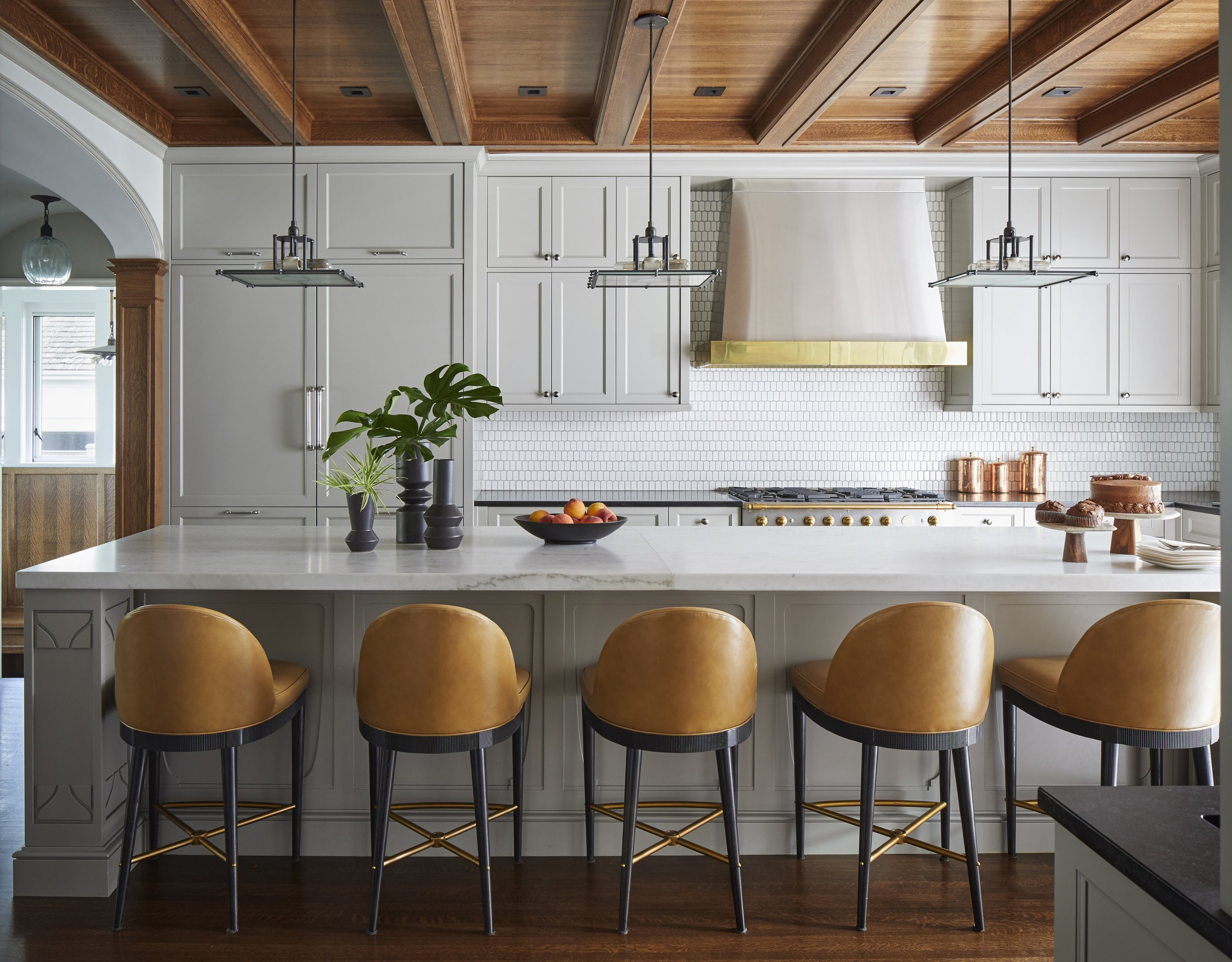
Properly designed seating for your guests can add dramatically to the visual appeal of the kitchen. Stools and chairs sized and spaced right look very inviting.
On the photo above - design by Donna Mondi from the Chicago firm showcases beautiful, generous, and comfortable stools by Hickory Chair.
However, when flipping through magazine's, and Social Media photos I often see that bar stools in these photos are of incorrect size. Even the famous designers, sometimes, show strange looking compositions and I wonder if the stools were brought in later for the photo-shoot, or purchased by the homeowner without consulting with the designer?
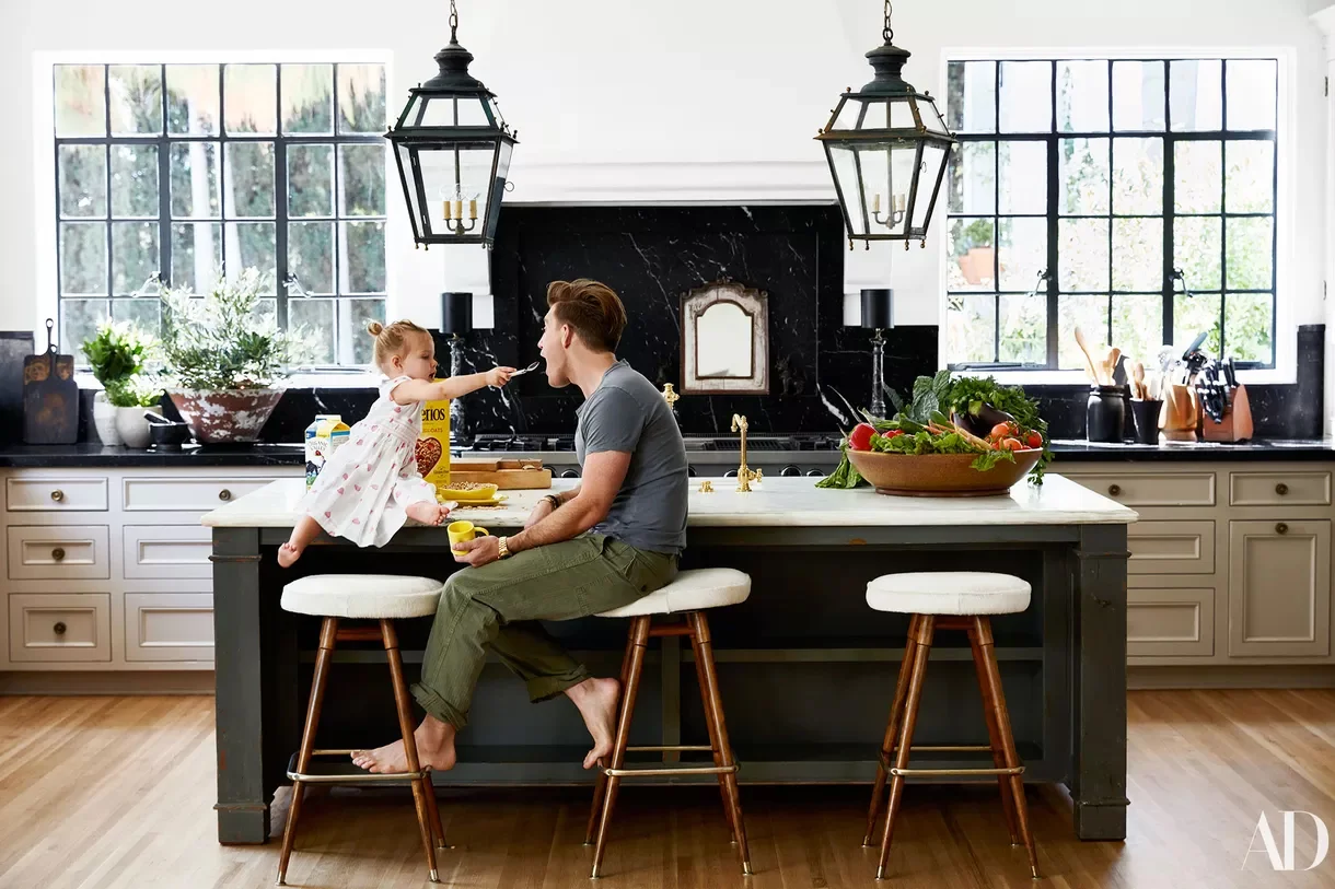
This is Nate Berkus in his own home - I do not know the logic behind this kitchen design, maybe he loves to sit sideways to the table, but it would be impossible to face the counter- there is an apron supporting the stone - no space for the knees.
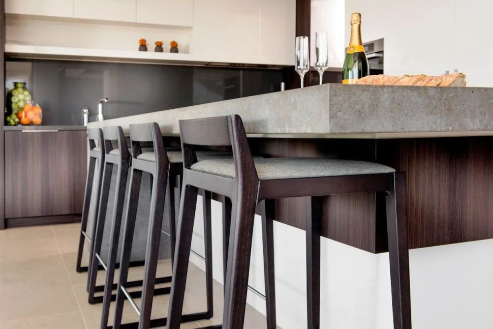
Sometimes, the stools are so tall - they'll make you hover over your food - literally. Sometimes the size would be so restrictive that there is no place for your legs.
(Photo on the right.)
I wanted to address that pet peeve of mine for some time now and finally gathered all the photos and sketches needed.
To illustrate very simple rules that are based on ergonomics and comfort Sophia (my wonderful assistant) produced fun sketches to address different table standards - 3 most common heights of the table surfaces in modern homes:
a dining room table (or a standard office table) is 30" tall - it needs a chair that is 17" - 19" at the cushion
a standard kitchen countertop is 36" and the stools that will be comfortable there should be 24"-27" at the seat. 3 inches difference is to accommodate different construction of the table, and different height of the owner
a bar height is 42" and the convenient seat will be 28"-30"tall.
The simple rule to remember is - there shall be at least 10-12" difference between the table and the seat of your stools. If you are a tall individual - pick up chairs that'll give you a bigger distance, if you are petite - do the opposite.
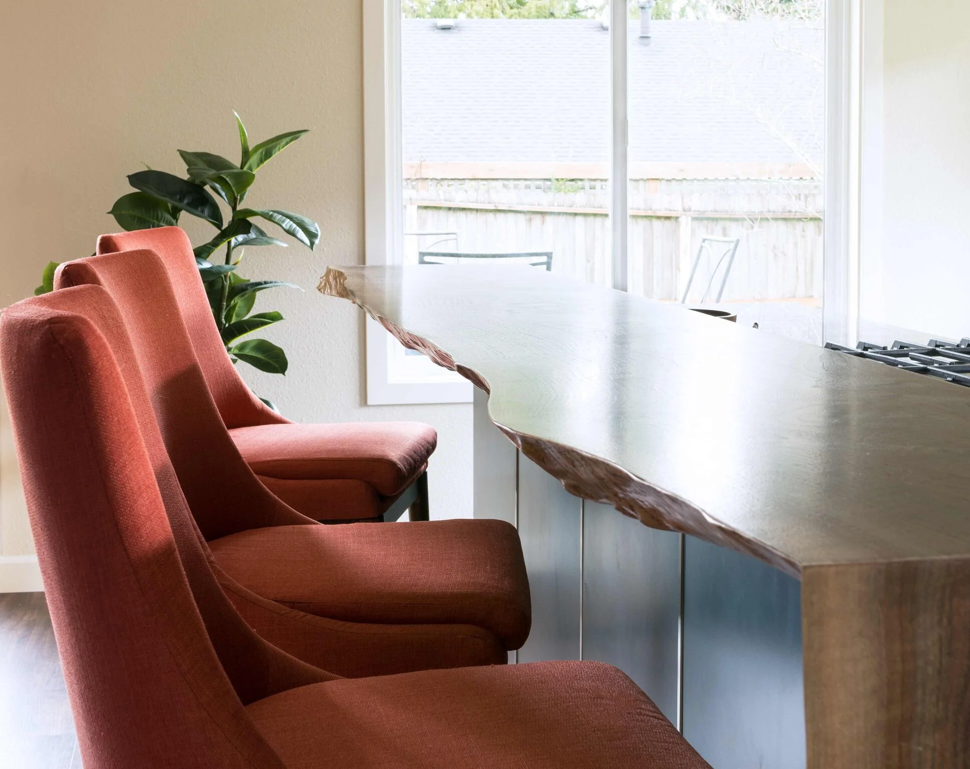
What to do if your countertop designated for the eating/bar area is of a non-standard height? I suggest to follow the rule above - measure your bar, subtract 12" or so - search for a bar stool accordingly. On a photo below is a bar area created for a young couple that loves everything related to mother nature.
Here we created a bar using a very thick slab of live-edge wood, which resulted in a countertop in between the standards - almost 39" high. To remedy - we chose bar stools that are on the tall end of the counter-height chairs - 26" at the seat.
A quick advice on how you should space your chairs in such a way that they do not look crowded, and most importantly, in such a way that your guests are comfortable:
The simple rule is - from the center of the chair to the next center of the chair there should be at least 24" and I'll allow at least 18" from the edge of the counter to the first center of the chair. These are absolute minimal distances based on comfort, of course, you can fit more chairs, but then it would be impossible to lift a glass, or a fork - your guests will end up in elbow fight :).
That is a quick summary that shall help you to furnish your kitchen sitting just right.
Designers / Houzz standoff
/There is a lot of discussion about a website platform called Houzz and Interior Designers, lately.
I am not sure if general public aware of that at all, so I will try and briefly explain what is happening.
A long time ago a homeowner frustrated with her own remodel process started developing a software that was geared to help other homeowners to find design specialists for their projects. To ensure that professionals they hire are trusworthy, and talented. Architects, Interior Designers, Craftsmen were urged to create a profile on the platform. We all jumped in, it sounded great, somebody was taking care of our marketing! It was very nice in the beginning, Houzz had a system in place to insure that a professional is truly in business (one of the ways is to post only genuine reviews), and we all had a small set or rules in place on how to promote the organic traffic to our profiles. First - load as many projects as you can, second - participate in the community unswerving questions that people post in Design Dilemma portal page, and third - be sure to follow up on all communication that comes your way.
Professionals across the board loved Houzz ( I know I did, hey, I even paid for being represented better), homeowners and DIY folks loved free advise and inspiration possibilities. But then Houzz changed it's angle and tweaked it's behavior: they started to sell furniture on their's own and to aid them in the endeavor they started to use our images. Now that was a problem for a lot of design professionals - when a designer makes purchases for custom items for their client they up charge the merchandise. It's much more fair then it's sounds - to specify a custom piece of furniture, to track it, to solve problems that arise along the way takes time and a huge liability (if I make a mistake - I pay for it). So, we charge for that time one way or another. I, for example, prefer to include that time in my per-project time. The very platform we used to promote ourselves, was now using our designs, our intellectual property to monetize and to sell merchandise (one needs to understand that the product sold on Houzz is a knock off of products that designers use, usually a less quality, and less design option). So, Houzz selling product was a problem for many specialists, they were hurting financially. But, in my opinion designers collaboration with Houzz created much deeper problems for the profesion then just money. If it would be just money - I would say to my fellow professionals: "duck, and adjust, change the way you charge, explain your system to your clients better... "
In my opinion the direction that Houzz took since 2014 is hurting the design profession in many ways. Let me explain - 1. Their algorithm gives us points for answering the community questions - was great in the beginning, but now folks are so used to that - we are loosing the appreciation for our time and professionalism that we are giving away free of charge. Houzz has made us a commodity. Nobody shall work for free, otherwise professionalism will become commodity.
2. Houzz bastardized our images - their Artificial Intelligence algorithm uses our designs, to tag our photos with little sale tags to sell the product that (remotely) looks like what we are using in our designs. Their color match is a joke - you can not judge colors correctly by a photograph.
3. Our clients are hurting - the assumption that you can recreate a design by shopping the image is just foolish, but it is also insulting people who did pay for the design, and now their homes work as a stripping board for DIY-ers to plagiarize upon.
4. The whole idea of a well designed home is just lost if you are trying to copy somebody else's way of living. Well designed home means a home designed for you, taking into the account all aspects of your life - how many children if any, how do you eat, how do you entertain, how do you rest, how do you want to be perceived......... If you copied the design - then your house is just that - an incomplete copy of someone-else life imprint .
5. Houzz created a way to keep us on their platform - if professional decides to leave than their profiles look like they went out of business.
6. With the Houzz recent acquisition of designers managing platform called Ivy there is a believe that the next step will be to prey on our personal information too.
It is not a surprise that Designers across the country mounting up a defense line: there is a petition opposing Houzz -
I would like to propose a solution - or steps toward solution if you will. I think we all shall state where our allegiances lie, and if Houzz is truly there to benefit homeowners, and to similtaniously support professionals they will take steps to mend problems.
First I would ask Houzz to list the name of a designer or an architect on the image, post multiple disclaimers saying that they do not support plagiarism, and are urging homeowners to use professional images solely as inspiration, reminding that good design is personal - always personal.
Second - it looks only fair to me, that Houzz shall pay a Royalty fee if they sell from the professional images of ours,
Third - Let's stop giving our advise for free. My proposal will be - do not change the algorithm, let us still answer those questions, but, if the homeowner, or non professional visitor of the design dilemma wants to see the professional answer - they shall contribute a small amount of money (3-5 dollars) to a charity of choice, there hundreds of people communicating in these dilemmas - so charities can benefit greatly. This way our service will be lifted from the advise that people who are not professionals post.
Fourth - stop creating an non fair representation if professional elects to leave the platform.
I sincerely feel that this will be a mitigation of the current standoff between Houzz and Designers.
I also feel that if none of the steps are taken then designers will leave the platform by thousands, and Houzz will be reduced to a platform that just sells mediocre furnishings, just like many others out there.
If I had a start money - I would be hard working by now gathering programmers to create a competing platform that will stay true to their word and do not jeopardize the very relationship that feeds it.
Full throttle
/Hello there, this is my first post on a new platform with my improved and revamped website.
As many of you know, I am an Interior Designer, motivated by strong belief that people should not be shy to live in homes that are created specifically for them.
Read MoreCanadian sense of humor
/We were taking a short vacation to Vancouver last weekend. Spent a bit of time walking in the Capilano park of course, it's all wonderful - the history, the engineering of the walks, abundance of ferns, and the public - very entertaining. Perhaps even better then the Mother Nature. Not every day you'll meet a giggling and jumping 50 some year olds for the sake of their picture on the suspension bridge. Look! No hands, no hands...
Read More